

Article by
Lee and Stuart
Lee Stancer & Stuart Allen – Kobb Interiors Ltd
Lee Stancer and Stuart Allen are the directors of Kobb Interiors Ltd, a Harrogate-based interiors company specialising in the design and installation of bespoke kitchens, bedrooms, home offices, and shutters. With a shared passion for craftsmanship and modern, thoughtfully designed spaces, they combine creative vision with practical expertise to deliver high-quality, tailored interiors.
Lee focuses on design, client experience, and brand direction, bringing a warm, contemporary style to each project. Stuart complements this with strong technical knowledge and project delivery, ensuring every detail is executed to the highest standard.
Together, they have built Kobb Interiors into a trusted destination showroom, offering premium products including solid surfaces as a Cosentino Elite partner, as well as leading appliance, tap, and furniture solutions. Their collaborative approach ensures every space is both beautiful and functional, designed to enhance the way their clients live.
Imagine standing in your newly finished Harrogate kitchen, where the morning sun catches the edge of a Silestone Eternal Calacatta Gold worktop. It feels ethereal, yet when you look at the photos on your screen, the atmosphere has vanished into a muddy, grey haze. You find yourself asking, "Can you make the images not as dark?" as you realize the camera has swallowed the very details that make the space a sanctuary. It's a common frustration for homeowners who value the quiet craftsmanship of bespoke cabinetry but struggle to translate that tactile warmth into a digital frame.
We understand that a truly high-end interior is defined by its emotional resonance, not just its layout. We'll show you how to move beyond yellow, artificial glares and flat shadows to create luminous, professional-grade images of your living space. This guide explores the delicate balance between technical exposure and design-led light reflection. You'll discover how to use integrated LED placement, material textures, and refined editing techniques to ensure your kitchen looks as radiant on camera as it does in person.
Key Takeaways
- Understand why camera sensors struggle with the high dynamic range of North Yorkshire period properties and how to manage these light levels effectively.
- Learn the professional editing hierarchy to address the question, "Can you make the images not as dark?" without compromising the rich, tactile details of your home.
- Use contrast and white balance adjustments to lift muddy shadows and reveal the authentic, sophisticated tones of your interior materials.
- Prioritize soft, natural morning light over artificial fixtures to maintain a serene atmosphere and avoid the distraction of clashing color temperatures.
- Explore how the integration of light-reflective surfaces, such as Silestone Eternal Calacatta Gold, creates a naturally luminous environment from the outset.
Why Interior Photos Look Dark: Science of Underexposure
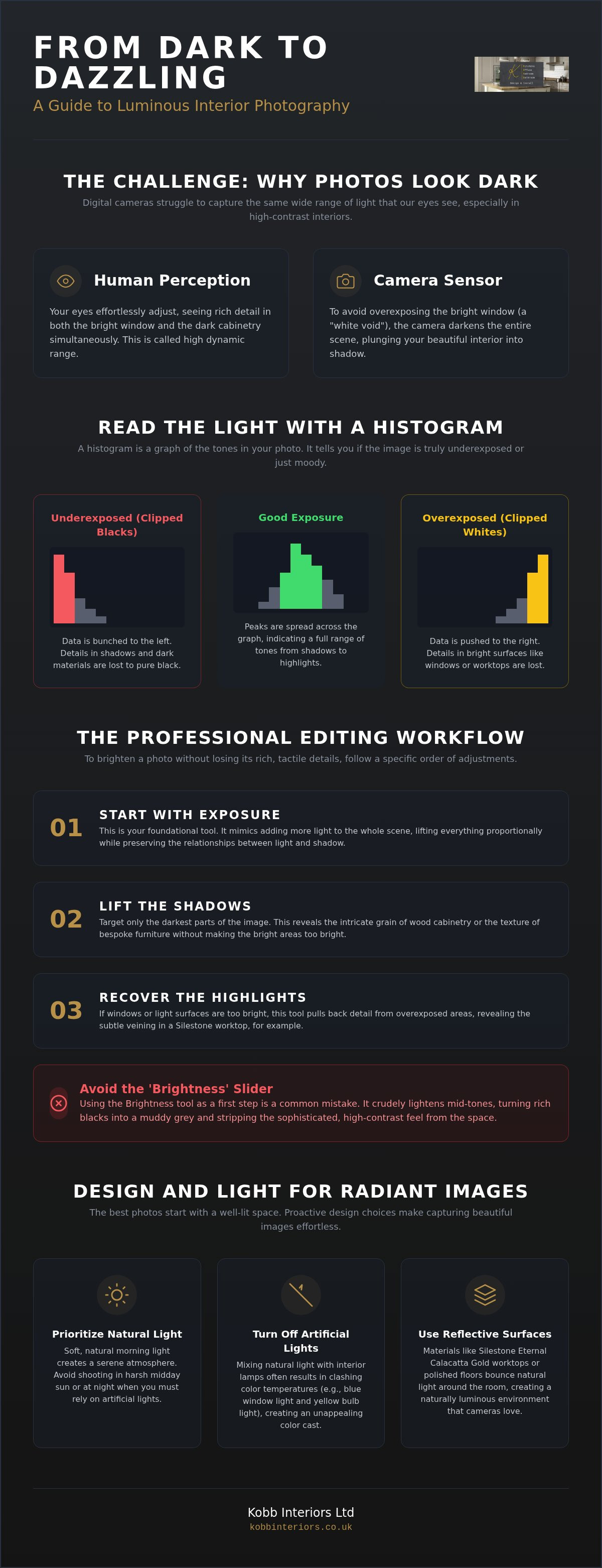
The frustration of a dim photograph often stems from a fundamental disconnect between human perception and digital sensors. When you stand in your kitchen, your eyes effortlessly adjust to the contrast between a sunlit window and the rich grain of oak cabinetry. Digital sensors are less adaptable. They struggle with high dynamic range, which is the vast difference between the brightest highlights and the deepest shadows in a single frame. When a camera sees a bright Harrogate sky through your window, its internal "brain" attempts to prevent the sky from becoming a white void. In doing so, it frequently plunges your interior into shadow, prompting the inevitable question: "Can you make the images not as dark?"
Distinguishing between a moody, atmospheric shot and an underexposed one is vital for a high-end aesthetic. A moody image uses shadow purposefully to create depth and focus, guiding the eye toward a specific texture or form. A poorly exposed image simply feels heavy, muddy, and lacking in detail. This challenge is amplified during the North Yorkshire winter. The soft, grey light common in the colder months provides little natural assistance, often resulting in raw captures that feel flat and uninspired despite the beauty of the physical space.
The Role of the Histogram in Interior Photography
Think of a histogram as a visual map of light. It is a graph that displays the distribution of tones in your image, from pure black on the left to pure white on the right. If the graph is bunched up against the left edge, you've encountered "clipped blacks." This means the intricate textures of your bespoke wardrobes or cabinetry have been lost to absolute darkness. A healthy interior histogram often looks like a series of peaks across the middle, showing that you've captured a full range of tones without losing the material essence of the room. Reading this graph allows you to see if your photo is truly dark or just high-contrast.
Common Culprits: Backlighting and Poor Metering
Backlighting is the most frequent thief of light in interior photography. Shooting toward a window often turns a handcrafted kitchen island into a mere silhouette. Your camera's metering system calculates exposure based on the average brightness of the scene. If a large window dominates the frame, the camera assumes the room is brighter than it actually is. Dark elements, like deep grey flooring or slate worktops, can also trick the sensor into miscalculating the necessary exposure. To overcome this, you must learn to override automatic settings, ensuring the camera prioritizes the elegance of the cabinetry over the view outside. You can see examples of balanced, luminous photography in our gallery, where every texture is preserved through careful light management.
Essential Editing Tweaks: How to Brighten Your Photos Instantly
When faced with a dim photograph, the immediate impulse is often to reach for the most obvious tool. However, the brightness slider is frequently a blunt instrument that compromises the visual integrity of your space. It shifts midtones indiscriminately, often turning deep, rich blacks into a muddy, unappealing grey. This approach strips the quiet confidence from a room, leaving it looking flat and artificial. If you find yourself asking, "Can you make the images not as dark?" the answer lies in a more nuanced hierarchy of digital adjustments.
A sophisticated edit begins with the Exposure tool. Unlike brightness, exposure mimics the effect of more light physically hitting the camera sensor. It lifts the overall luminance while maintaining the relationship between light and shadow. Once the base level is established, targeting the Shadows slider allows you to reveal the intricate craftsmanship of your cabinetry. This is particularly effective for showcasing the joinery in bespoke kitchens without overexposing the natural light flooding through a window. Conversely, the Highlights slider is your primary tool for reclaiming detail in bright surfaces, such as polished Silestone worktops or porcelain sinks, ensuring they don't appear as featureless white voids.
The Exposure vs. Brightness Debate
Exposure is the preferred starting point because it preserves the serene atmosphere of a well-designed home. While brightness merely lightens the middle values of an image, exposure scales the entire tonal range. This distinction is vital for maintaining the material quality of organic substances like timber or stone. Use exposure for the primary lift and reserve brightness for subtle, final touches where you need a gentle shift in the mid-range without affecting the absolute black points of the frame.
Lifting Shadows to Reveal Bespoke Details
Shadows often hide the very elements that define a high-end interior. Dark alcoves, deep pantry shelves, or the underside of a kitchen island can become lost in a single exposure. Local adjustment brushes allow you to "paint" light into these specific areas. This technique reveals the texture of the wood grain and the precision of the hardware without washing out the rest of the room. When Lighting Your Home for the Camera, these digital refinements act as a final layer of craftsmanship. By lifting shadows selectively, you ensure the functional utility of the space is visible while preserving its emotional warmth. If you're looking for inspiration on how light and shadow can coexist beautifully, our gallery offers a benchmark for luminous, detailed design.
Beyond Brightness: Preserving Detail and Texture in Luxury Spaces
Lifting the exposure is only the first movement in a larger composition. Once the light levels are adequate, the focus must shift to the tactile preservation of the materials. If you simply increase exposure and stop, the image often feels hollow. You might still wonder, "Can you make the images not as dark?" because the lack of definition makes the room feel recessed and flat. Contrast is the silent anchor here. It ensures the deepened tones of your cabinetry remain grounded, preventing the space from looking like a washed-out render. High-end aesthetics rely on this balance; the shadows must remain purposeful to give the highlights their value.
Correcting Colour Temperature (White Balance)
Artificial lighting in many Harrogate homes often leans toward a heavy amber hue. While this creates a cozy atmosphere in person, it can make a brightened photograph look "dirty" or unnaturally yellow. To restore a sense of serenity, you must find a neutral reference point within the frame. A white ceiling or the polished chrome of a Quooker tap serves as an excellent "true white" anchor. By cooling the temperature slightly, you can replicate that crisp, airy Yorkshire morning light. This adjustment removes the artificial "film" from the image, allowing the authentic color compositions of your bespoke kitchen to emerge.
Adding Depth with Contrast and Clarity
Luxury interiors rely on the interplay of physical surfaces. To maintain the material quality of Dekton or Silestone worktops, utilize the Clarity and Texture sliders with restraint. Clarity enhances the mid-tone contrast, making the crisp lines of 1909 shaker-style doors stand out with architectural precision. This creates a sense of three-dimensional space rather than a flat, two-dimensional image. However, exercise caution. Over-sharpening can make even the most meticulous hand-finished cabinetry look brittle and cheap. The goal is to enhance the existing craftsmanship, not to create artificial edges that don't exist in reality.
Sophisticated color palettes are best managed through Vibrance rather than Saturation. While saturation intensifies every pixel, vibrance targets the muted tones, allowing the subtle hues of your cabinetry to sing without becoming garish. This meticulous attention to detail ensures the emotional resonance of the room is preserved. It reflects the quiet confidence found in our design gallery, where every material is chosen for its longevity and visual harmony. By focusing on these nuanced adjustments, you transform a simple bright photo into a luminous showcase of high-end living.
The Secret to Radiant Images: Lighting Your Home for the Camera
Capturing a space requires more than just a lens. It's about orchestrating the light before you ever press the shutter. Homeowners often ask, "Can you make the images not as dark?" yet the solution begins with the physical conditions of the room. Morning light, often called the interior golden hour, provides a soft, indirect glow that wraps around furniture rather than creating harsh, jagged shadows. This serene illumination is the foundation of high-end photography. It preserves the authentic color of your cabinetry and the delicate veins in your Silestone Eternal Calacatta Gold worktops.
Clashing color temperatures are a common pitfall in residential photography. To achieve a professional finish, turn off all artificial overhead lights. These bulbs often cast a heavy yellow tint that competes with the cool, natural light from outdoors. If specific corners of your fitted bedroom remain in shadow, use white foam boards or simple reflectors to bounce light back into those areas. This subtle technique fills the frame without the need for intrusive flashes. Using a tripod is equally transformative. It allows for longer exposures, pulling more light into the sensor to create a bright, clean image without the grainy noise that ruins digital files. This technical precision ensures you'll never have to ask, "Can you make the images not as dark?" after a successful shoot.
Harnessing Natural Light in Yorkshire Homes
Managing light in Harrogate or Wetherby properties requires a tailored approach. South-facing lounges in Wetherby often suffer from aggressive, direct sunlight that can bleach out textures. Our plantation shutters are an ideal solution for these spaces. They allow you to tilt the louvres, diffusing harsh rays into a gentle, luminous glow that fills the room evenly. Position your camera so the primary light source is to your side or slightly behind you. This side-lighting emphasizes the three-dimensional quality of your joinery and the tactile surfaces of your home.
Using Integrated Lighting as a Design Feature
Artificial light isn't always the enemy if it's integrated with purpose. Under-cabinet lighting in a bespoke kitchen adds essential depth, preventing dark voids on the worktops and highlighting the splashback. Similarly, media unit lighting creates a layered effect that guides the eye through the photograph. The key is to capture the glow without the glare. When these elements are designed with luminosity in mind, they serve as focal points that enhance the overall exposure. If you're ready to design a space that naturally captures the light, contact our design team today to discuss your project.
Designing for Light: How Kobb Interiors Creates Naturally Bright Sanctuaries
The most effective way to ensure a photograph radiates warmth is to begin with a space designed for luminosity. While digital editing tools are powerful, they cannot fully replicate the organic glow of a room that embraces natural light. When homeowners ask, "Can you make the images not as dark?" the most sustainable answer is found in the architectural bones of the interior. We approach every project by considering how light travels, utilizing reflective surfaces to bounce illumination into every corner of the room. This design-led approach creates a foundation where photography becomes a simple act of capturing existing beauty.
Light-reflective worktops, such as Silestone and Dekton, serve as more than just durable surfaces. They act as horizontal mirrors, catching light from windows and dispersing it across the cabinetry. In smaller or naturally dimmer Harrogate kitchens, we often integrate glass-fronted cabinetry and bespoke mirrors to create a sense of expansive depth. This deliberate choice of materials ensures the room feels airy, regardless of the weather outside. Our kitchen colour schemes for 2026 prioritize this sense of sanctuary, leaning into palettes that enhance perceived brightness through subtle, earthy neutrals.
Material Selection for Luminous Living
The interplay between high-gloss and matte finishes significantly alters the "light feel" of a room. High-gloss surfaces offer sharp reflections that can energize a space, while matte finishes provide a soft, diffused glow that feels serene and grounded. For those seeking a bright, luxury aesthetic, "Eternal Calacatta Gold" Silestone remains a benchmark for elegance. Its white base and subtle gold veining offer the perfect canvas for light to play. To manage this illumination, plantation shutters offer the ultimate control, allowing you to sculpt the light entering your Yorkshire home with precision and ease.
From Vision to Reality: The Kobb Interiors Process
Our design journey begins with a meticulous 3D phase. This allows you to visualize light levels and shadow placements long before a single piece of cabinetry is installed. It's our commitment to creating spaces that feel like a sanctuary, even on the most overcast York afternoon. We invite you to explore our gallery for inspiration on how radiant design can transform a home. By designing with light as a primary material, we ensure your living space is always ready for its close-up, naturally answering the plea to "make the images not as dark" through thoughtful, expert craftsmanship and 40 years of industry experience.
Illuminating the Heart of Your Home
Transforming a dim interior into a luminous showcase requires a delicate equilibrium between digital refinement and physical design. By moving beyond the blunt instrument of the brightness slider and embracing the nuance of exposure, contrast, and white balance, you preserve the tactile soul of your materials. You no longer need to worry about the common question, "Can you make the images not as dark?" because you've mastered the interplay of light and shadow. A truly high-end space doesn't just look bright; it feels radiant through the purposeful selection of textures and tones.
At Kobb Interiors, we believe a beautiful space should serve as a sanctuary. With 40 years of Yorkshire craftsmanship and full project management, we ensure every detail is executed with a refined, steady hand. To make your vision attainable, we also offer finance options available via Novuna. Design your luminous bespoke sanctuary with Kobb Interiors and create a home that resonates with quiet elegance and enduring light. Your journey toward a more radiant living space begins with a single, thoughtful step.
Frequently Asked Questions
Can I brighten a photo on my phone without it looking grainy?
You can achieve a cleaner image by using the exposure tool instead of the brightness slider. Grain, or digital noise, typically occurs when a phone sensor struggles to find light in the shadows. To minimize this, ensure you are shooting during the brightest part of the day in your Harrogate home. Using a tripod or resting your phone on a stable surface allows the sensor to capture more light without introducing the grain that ruins high-end aesthetics.
Why do my kitchen photos look yellow even when I brighten them?
This amber tint is usually the result of clashing color temperatures between natural Yorkshire daylight and indoor artificial bulbs. Most residential lighting leans toward a warm spectrum that cameras interpret as heavy yellow. To fix this, turn off all overhead lights and rely on natural light. You can also adjust the white balance in your editing app to introduce cooler tones, which restores the serene, authentic color of your bespoke cabinetry and worktops.
Is it better to brighten a photo using Brightness or Exposure?
Exposure is the superior choice for luxury interior photography because it scales the entire tonal range. While the brightness tool often makes deep blacks look muddy or grey, exposure mimics the effect of more physical light entering the room. This distinction is vital for preserving the rich textures of handcrafted furniture. If you find yourself asking, "Can you make the images not as dark?" always reach for the exposure slider first to maintain a sophisticated, natural look.
How do I fix a photo where the window is white but the room is dark?
This common issue occurs when the camera meters for the bright sky rather than the interior. To balance the frame, use the shadows slider to lift the light in the room and the highlights slider to reclaim detail in the window. Many professional apps also offer local adjustment brushes. These allow you to selectively paint light onto dark cabinetry or kitchen islands without overexposing the already bright window area, creating a harmonious and professional composition.
What is the best app for brightening dark interior images for free?
Adobe Lightroom Mobile and Snapseed are the most sophisticated free tools for enhancing interior images. These applications provide granular control over shadows, highlights, and white balance, which are essential for a professional finish. They allow you to address the question, "Can you make the images not as dark?" without using destructive filters that strip away material quality. These tools help you showcase the craftsmanship of your Ripon or Wetherby property with clarity and precision.
Do dark kitchen cabinets always make photos look gloomier?
Dark cabinetry adds a sense of quiet confidence and depth rather than gloom when the room is designed for luminosity. The key is to pair deep tones with light-reflective surfaces, such as Silestone Eternal Calacatta Gold worktops. In our Harrogate projects, we use these materials to bounce light back into the room. When captured with the correct exposure, dark cabinets provide a sophisticated anchor that enhances the overall emotional resonance and structure of the photograph.
How can I make my bathroom photos look bright and spa-like?
Achieving a spa-like atmosphere in a luxury bathroom requires soft, diffused light and a crisp white balance. Avoid using harsh overhead spotlights that create unflattering glares on polished chrome or porcelain surfaces. Instead, utilize natural light diffused through plantation shutters to create an even, gentle glow. Cooling the color temperature slightly during editing will enhance the sense of serenity and cleanliness, making the space feel like a true sanctuary in your North Yorkshire home.
Can professional editing save a very dark, underexposed photo?
Professional editing can reclaim a surprising amount of detail, but it cannot create information that was never captured. If a photo is so dark that the details in your bespoke storage are completely black, that data is lost forever. However, if you shoot in a RAW format, you retain a much wider range of tonal data. This allows an expert to lift shadows and adjust exposure significantly while maintaining the material quality and tactile texture of the interior design.
Finance Available
* Kobb Interiors Ltd is an Introducer Appointed Representative of Ideal Sales Solutions Ltd, t/a Ideal4Finance. Ideal Sales Solutions Ltd is a credit broker and not a lender (FRN 703401). Finance available subject to status. The rate offered is always provisional and will depend upon your personal circumstances, the loan amount and the term.


